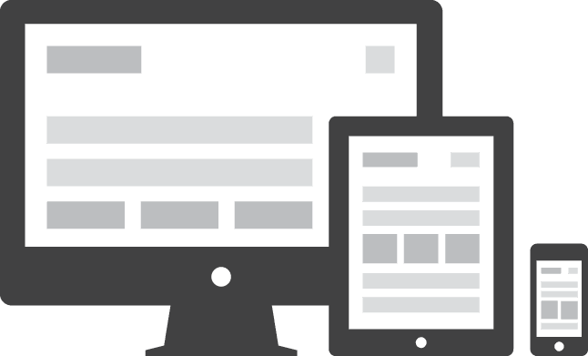
2013 is the year of responsive web design (RWD). But what is responsive web design and how can we use it?
Not even five years ago almost everyone was browsing the Internet with laptops or a desktop computer. The life of a web developer was relatively easy, from 800x600 till 1900x1440 screen sizes you needed to cover but not much more. You could create a totally static page with just one set of layout rules and everybody would be happy, and every browser would display the page the way you made it.
Today however, people browse from thousands of different devices, from phones to tablets, Eee pads, laptops, computers and even iPods. All of which have different screen sizes. This drastically changed the web development approach, introducing media queries and a new way of designing websites: responsive web design.
What is responsive web design?
Responsive web design is a design approach with which we try to create one website for all devices. The basic elements of responsive web design include a fluid grid concept, flexible images and media queries.Fluid grids
A fluid grid is a grid of elements usually divs, that all have proportional sizes (percentages instead of pixels). When all the elements of the grid have their width and or height proportional to the size of the screen it scales on all devices. This is already a nice thing, though we should also make sure that the content of the grid is resizes as well.Flexible images
If there is something to be flexible then this is in the first place the images we use. Flexible images are images with their width in percentages instead of pixels. Usually they have their width to 100% of their container. This way the image will never run outside its boundaries. Drawbacks can be though that the image becomes too large on HD screens, resulting in a pixelated appearance. Or the image becomes so small on small screens that it becomes useless.
Media queries
With media queries in CSS you can apply specific CSS rules only when certain conditions apply. You can for example create a media query on Max-Width.
@media screen and (max-width: 600px) { img{ width: 100%; }}
Now the image on this site will appear 100% of the container width if the screen width is smaller or equal 600px. If the screen is larger, the image will not have the 100% rule. This way we can for instance make a web page with an image and a few lines of text appear on small screens like:

And on big screens like:

This we can do with the Media query max-width, and by setting "float:left;" for the image.
We can also use media queries for a whole css stylesheet. To do so we need to add the media query declaration in the head of the html file.
<link rel="stylesheet" media="screen and (max-width: 600px)" ...
We can do many more media queries so to adapt our design for all kind of devices.
On this site from CSS-Tricks you can find a nice list.
Text in responsive designs
Text in responsive websites can give problems. For instance the text might be too big for the container that holds it. To solve those problems we can make sure that the containers height varies depending on the text, but sometimes this is not what you want. If you want to keep the restrictive height the only solution is cutting the text nicely and making sure the whole text can be seen in another way. A solution could be a "more" button for example that enlarges the container when clicked.
Clipping the text we can achieve by applying the following css rules:
overflow:hidden;
text-overflow:ellipsis;
The first rule makes sure the text is not visible outside the container, the second line makes sure that the clipping of the text is rendered like "...".
This can also be handy with titles in headers for example. If the title on a mobile phone header is too big, it is usually not a problem whether the text is clipped. If the text is not clipped however it will run out of the header and might break the style of the page below.